Introducing Interplay AI to create and maintain your design system documentation ⟶
ChangelogWe’re constantly improving Interplay. Here are the latest features and improvements.
Oct, 2023
- Prevent the page from jumping around when page has no quick links
- Update follow on AI actions
- Clear content if empty
- Add NPM Import to Components Empty state
- Clear contentUpdates when all clients disconnect from editor
- Enable creating CodePreview from scratch
- Fix AI working with design components
- Add home empty state actions
- Remove dashboard onboarding
- Add ability to upload videos
- Update help URLs to use interplay.run
- Fix for non-array children property
- Ensure fileId is safe to save in the DB
- Always link the new component from the template modal
- Migrate old data format
- Display first page with content
- Remove Tabs from Child content
- Prevent full page reload for PageList
- Fix QuickNav layout
- Fix bug switching Props table component in Chrome
- Editor UX updates
- Add ability to turn off AI
Aug, 2023
- Switch to ESM builds for preview
- Upgrade Editor to fix bug with BubbleMenu
- Add Avatars to DS Toolbar
- Update Toggle List to act more like Notion
- Fix bug with new components in Plugin Specs
- Update where we load the commit object from
- Add Nav Sections
- Add logging for auth error
- Only use code components for tokens previews
- Tidy up spacing
- Format QuickNav
- Add in page links
- Upgrade Editor, content style tidy up, add CodeBlock formatting
- Fix check for page limit when duplicating
- Docs UI tweaks
Jul, 2023
- Add Grouped By for Figma component imports
- Add CLI Connections
- Add Connections Tab
- Update Figma Auth URL
- Fix issue with Specs after data upgrade
- Add ability to import design tokens and components from Figma
- Load project data in component props preview and fix restricted bug
- Enable users to select non-visual nodes in Figma
- Hide specs behind feature flag
- Remove color from pencil svg
- Add delete project to toolbar
- Update Docs empty state and DS Toolbar UI
- Update help URLs
- Allow components to render before processing nodes
- Re-calculate size after images load
Mar, 2023
- Handle React components which return Fragments
- Ensure domains are case insensitive
- Remove Man-In-The-Middle component
- Fix issue with teamId for docs URLs
- Move ds project settings to a full page
- Add 404 when project not found
- Make settings icon more visible over dark images
- Fix bug when no content exists
- Remove Play button
- Tidy up content types
- Make tabs children of home
- Add readonly mode for docs
Jan, 2023
- Details example displaying as expanded in Figma
- Tabs component not showing in Figma plugin
- Add version info to plugin
- Fix dark mode
- Fix zIndex issue for Input component
- Update layer naming in Figma
- Use custom bg color for the docs examples
- Add ability to change the default example bg color
- Dark mode tweaks
- Fix bug with applying component updates
- Add admin tool to export/import data
- Add publish actions
- Improve Figma Plugin stability
- Handle fonts in data-uri
- Update plugin navigation
- Fix bug when user has no display name set
- Fix index order for figma translations
- Fix loading instances with mixed override values
- Display pill to show which spec screens/components have changed
Dec, 2022
- Display the first example thumbnail
- Fix display of thumbnails in the app
- Fix issues generating thumbnail when preferred font not loaded
- Enable swapping over token values in design component instances
- Ensure item exists before reselecting
- Prevent nested components getting width set unintentionally
- Save invisible changes to the config to Figma metadata
- Fix toggle states in the stylebar
- Style-bar scrolls you to the top when you select a style on a long page
- Don't display sub components in the plugin search
- Add trailing render for text props debounce
- Support CSS Colors Level 4
- Keep the dropdown closed when we are detaching tokens
- Add 'Open in Interplay' on a Figma component
- Update Figma Translations
- Only add Figma Components manually selected to specs
- Add 'Open in specs' link to plugin
- The icon button persists while the dropdown is open
- Update project used for Load sample spec
- Default Token Groups to type `color`
- Allow user to unset type for token group
Nov, 2022
- Add Callout icon in slash menu
- Stylebar not working in prod build
- Update link color in the block editor
- Add affordance that you can reorder content tabs
- Rename presets to examples
- Update LogoPicker interactions
- Fix for public projects
- Ensure we remove any extra props which are no longer set on the component
- Add currentContext to the translations API
- Fix token name typos
- Tailwind component erroring when prop updates
- Improve performance by using new Figma API methods
- Fix issue with dismissing onboarding modal
- Add Interplay API for translations, fix bug with fn values of translations
- Docs Navigation design tweaks
- Update shadows
- Better editing of translations in the app
- Fix SVG rendering in Figma preview
- Prevent Figma Text line height from being corrupted by other CSS includes
- Add support for Absolute position elements inside autolayout
- Pass through default again
- Correctly identify COMPONENT_SET
- Update semantic tag for callout
- Add Callout block
- Improve spacing for nav
- Add more affordance for which type of page you are editing
- Fix layout for components
- Click to open spec
Oct, 2022
- Converting Group to Autolayout converting Figma layers to code components
- We should not use the default setting as it's often wrong, e.g. NextUI Navbar height. The default should be on the code component
- We need to keep 'unset' to set the width when item scaled or pinned left and right. e.g. NextUI Card component
- Fix bug with transform resizing
- Support CSS filter shadows
- Update shadow
- Tweak dashboard layout
- Add cover for projects
- Update placeholder for Specs
- Fix how projects are created to prevent DOM elements being added to the project
- Reduce RTE Slash options in Specs
- Dark mode tweaks
- Fix bug with initial size being wrong
- Fix z-index problem with tokens
- Update default order for DS tabs
- Update Tokens Empty State
- Add Import DS
- Update new DS modal
- Dismiss onboarding when steps complete
- Add app onboarding steps
- Replace onboarding video with templates
- Tidy up dashboard pages
- Update Dashboard Layout
- Update Plugin Empty State
- Add Plugin Onboarding
- Fix JSON to code parsing
- Ensure Interplay context is loaded correctly
- Add Example button when there are no examples
- Fix issue with undo/redo not working
- Only show selected state for RTE nodes when editor is focused
- Fix JSON to JSX translation issues
Sept 30, 2022
- Fix bug updating token values in plugin
- Fix for webcomponents unmounting
- Fix bug with relative top, left calcs
- Calculate domHash with the relative positions to reduce re-renders
- Plugin Dark mode updates
- Fix bug using native components
- Enhance positioning when dropping components into Figma Autolayout layers
- Support Figma SECTION node
- Fix preview size bug when node not loaded
- Fix detach/re-attach when top level node
- Remove presets from search results
- Support images in the props panel select input
- Support for Figma ON_HOVER event
- Only pass parent props to Figma child elements
- Load overrides and events on initial load from Figma
- Fix auto-zoom on node preview
- Capture JSX generating exceptions
- Fix issues rendering Radix Dialog components
Aug 26, 2022
- Imporove invite users experience
- Update when project restriction messages are displayed
- Add confirmation before locking down project
- Update workspace security
- When you create a new workspace, switch to that workspace
- Dashboard headings and sort label wraps below 1200px and breaks layout
- Use auto resize textarea with resize set as vertical
- Truncate token type and value if is too large
- Only display token copy button if token has a value
- Fix bug where Symbol used on instance override
Jul 29, 2022
- Fix issue with autolayout taking full width
- Handle when Node is not found
- Fix rendering of groups
- Workaround for Figma bug changing type between Frame and Group
- Remove fill styles from svg layers
- Update position of child nodes when you add autolayout to the parent in Figma
- Enable switching themes in the plugin preview
- Get the correct default theme
- Add live preview to Inspect
- Fix bug switching between libraries in the plugin
- Improve performance loading commit data
- Fix Can't delete a new component property unless you close and reopen the Component Settings modal
Jun 24, 2022
- Fix typography font size token also displays the token of line height type
- Toggle dropdown isOpen by default when click on trigger element (#178)
- Load commits directly form the storage to improve performance
- Add Object token type
- Fix bug not being able to select nested nodes
- Improve experience when renaming a project
- Allow adding padding and gap tokens to components
- Reverse shadow order for Figma
- Add Shadow Array token preview
- Display array token values as string
- Support multiple shadows tokens
- Add size subtype for dimension tokens
- Update sample token types
- Fix tooltip usage within dropdown (#176)
- Update token types to match the latest W3C Spec
- Handle updating multiple theme tokens
- Split usedFor and type option on token/token group editing
- Add tooltip on hover to items in the token picker list
- Improve experience when viewing archived project in the Figma plugin
- Add narrow view without components preview
- Improve token parsing
- Fix dark mode issues
- Support transparent background color
- Fix typo with W3C spec name
- Create token preview examples in a branch to prevent them being saved. Otherwise they get outdated
May 27, 2022
Fixes & improvements
- Add TokenPreview for imcoming figma updates
- Upgrade Figma typings
- Add create new project at the beginning of select options
- Support Emoji components in Figma
- Add ability to copy design token reference
- Include subfolders to component sidebar search
- Update create workspace modal to the latest modal component and styles
- Improve interaction with project name
- Round line height and letter spacing to 2 decimal places
- Dashboard UI tweaks
- Fix issue with external framer-motion in CLI
- Support formatting of composite token values in the token reference list
- Add beta feature flag for embed links
- Add free trial
- Add Continue to Dashboard button from Figma auth
- Fix plugin auth issues
- Fixed rendering issue for pseudos inside self-closing-elems
- Customise Help Button links based on the page it's on
- Auto open edit mode for preset after creating
- New Onboarding assistant component (#152)
- Fix for loading cross-site images for thumbnail generation
- Fix issues with creating forks
- Update Flowting Window maxHeight to use Scrollbars component
- Add ability to set css variable values from extensions
- Fix issue with `dom-to-json` not working for web components
- Add max height to floating window content
- Add a context menu to component folders in the thumbnail view.
- Support for web components imagegen thumbnails
- Add support for 100% width for presets in Fimga
- Add em and % support for letter spacing
- Performance updates for WideTokenList
- Handle code components nested in Figma frames
- Allow users create sample design systems and Inspect projects
- Update Token Preview pages
- Update to latest theme spec. Add format dropdown to editor
- Add web component support for image generation
- Remove Stencil specific wait because componentOnReady method doesn't seem to work for our purposes
- Misc performance updates
- Improve calculating overrides
- Project search result ordering does not match the selected ordering
- Partial update for spec change from `fontName` to `fontFamily`
- Fix when the name of the include ends with `.js`
- Add ability to order includes by index
- Throttle of Figma renders to imporve performance
- Update the sort ordering for folders in the components list
- Update token parsing format names
- Allow moving position of Edit Token window
- Add fontWeight support for type tokens in Figma styles
Apr 11, 2022
- Add support for latest W3C Token Spec
- Re-render Figma code components when the parent Figma frame resizes
- Add em and % support for letter spacing
- Added CLI support for splitting webpack builds
- Enable setting 100% width on the container for presets
- Only display tokens from selected themes in the token JSON editor
- Improve token json parsing on imports
- Improve guessing token types from theme object imports
- Export extensions data as part of the token spec json
- Added format switcher when editing tokens and added save option to reduce errors
- Fix tokens page crashes if you go to an incorrect group path URL
- The clear button in Search component adds width to the search box
- Change the code icon in the Token editing toolbar to a tab component
- Update the sort ordering for folders in the components list
Mar 28, 2022
- Released new project navigation
- CLI updates for yarn2 (yarn berry)
- Deployed new tokens editing experience
- Major Figma plugin stability updates
- Fixed rendering issues with web components.
- Added improved logging when error in user overridden function
- Duplicate customer + subscription in Stripe
- Issues with component not display in webapp preset panel
- Weight of type tokens is not set correctly in Figma styles
- "Edit preset" missing on some component presets in same DS
- Plugin content replaced with rendered frame content
- BaseUI has type set to an object when array of arrays
- Can't add a second token group if you haven't renamed the first one
- Shadow preview in the token input spills across the whole input
- While editing text on canvas, the text defocuses
- Truncate long token paths in the edit token modal
- Token Editing: Contextual menu stays open when you select `edit token`
- Properties panel: Clear string on unset value button click
Mar 14, 2022
- Add border-radius tokens for Figma shapes
- Add ability for sass bundling in CLI
- Add a link to Slack community to the help menu
- Editing JSON caused the token info panel to hide, but the token list didn't take up the available space
- Imported JSON had a token type of "size" meant no type was shown in the UI, but type was not inherited
- Prevent crash when string tokens have non-string value
- After entering a token value, hitting tab focuses the address bar
- Pushing frame to Interplay prod showing wrong frame in Inspect clickthrough
- "Create new design system" button not working correctly after switching teams
- Fix create account flow typo
- Improve truncation of referenced tokens in the UI
- Ordering of Properties is reversed in the Preset editing modal
- Dragging to set a colour highlights the whole page
- Clicking on another tab while editing JSON loses changes
- Add token popup on hover, context menu for row and duplicate token
- Line height tokens not showing up in line-height property for typography tokens
- Version history empty state says 'commit changes to the project'
- Fix padding in the history panel
- Add Figma onboarding tip
- Problem generating Figma styles from tokens
- Figma styles order does not match order of tokens
- Allow token values to go to 4 decimal places
- Add the ability to delete screens and components from Inspect.
- Support for importing design tokens from repo using Interplay’s design tokens API
- Fixes to run CLI on Windows environments
Feb 28, 2022
- Added support for parsing d.ts files instead of component source code
- Added support for react/jsx-runtime - i.e. React components that don’t import React
- Added option to export presets to local JSX files in CSF format to create curated set of presets for designers in your repo
- Add ability to use space tokens on all sides of auto-layout frames in Figma
- You can now edit more than one value in the UI with JSON editor open
- Upgraded to webpack 5 for bundling imported code
- Automatically pre-pend the # if a hex value is specified for a colour value without the #
- Rem token units aren't being converted to px when used in Figma
- Cannot set the width on a preset container
- Change file limit of recent projects tab to be unlimited
- Token select Hover state is 'janky' in Safari
- Improve support for rendering web components in Figma
- Token popup is in the wrong position when the Edit JSON panel
- Pushing design components to interplay prod fails to open project
- Fix issues with image generation
- truncate ds name when too long
- Clicking outside an editable text filed loses the text changes
- Fix pseudo-element auto margins issue
1st Feb 2022
Design Token SupportNow you can keep your design tokens in Sync with Interplay and your design tools.
Design tokens provide a way for designers to maintain complete control over the values in their design system. Your tokens are your single source of truth for keeping your design system values in sync with every other project in your organisation. However, until now it was hard to keep tokens in sync across all your design and dev tooling.
We have built our token support from the ground up to work with the upcoming Design Token Community Group standard. We also support tokens from Styled Dictionary and Theme UI format. For other formats it's easy to write a transform before importing.
Sync Design Tokens from Code
Ensure design and engineering are always in sync with the same interplay CLI used to import your components.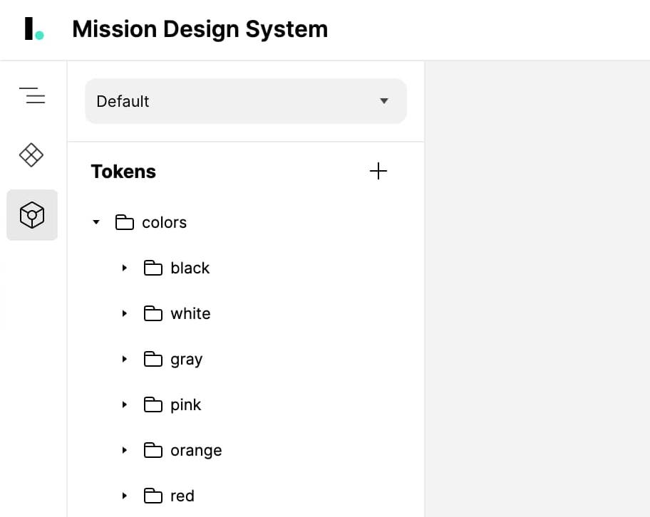 Use Design Tokens in Figma
With the Interplay plugin, you can use those Design Tokens on any layer within Figma. The tokens displayed are based on the layer type selected. And if you have Auto-layout on a Frame, you can use spacing tokens for Padding and Gap too!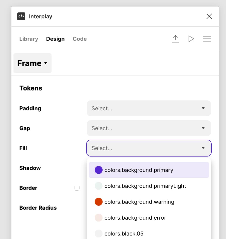 Design Tokens in Code View
When tokens are used in the design process, an engineer can copy the values directly from the code view. You can customise how the tokens are accessed for your system, and can have multiple formats for different target platforms.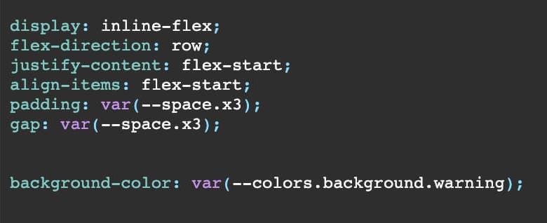 Supports Theming
We support multiple themes for tokens. Any Tokens not overridden in a theme will default to the configured default theme. Themes can also inherit from other themes!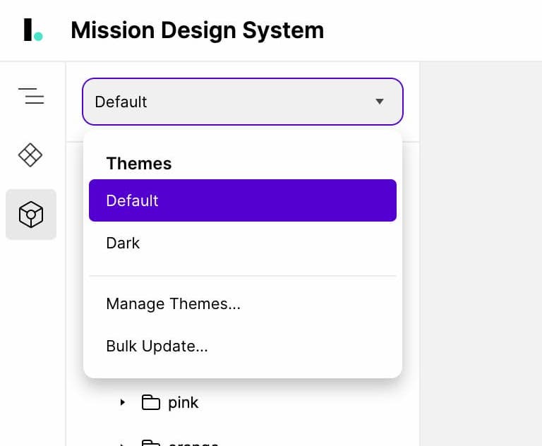 Switch Themes in Figma!
You can select any top level frame in Figma and change the theme used. This will update the values for all tokens used in that frame!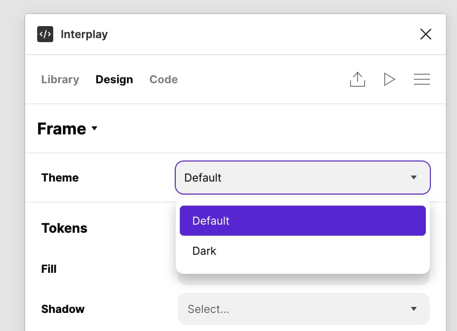
Design tokens provide a way for designers to maintain complete control over the values in their design system. Your tokens are your single source of truth for keeping your design system values in sync with every other project in your organisation. However, until now it was hard to keep tokens in sync across all your design and dev tooling.
We have built our token support from the ground up to work with the upcoming Design Token Community Group standard. We also support tokens from Styled Dictionary and Theme UI format. For other formats it's easy to write a transform before importing.
Sync Design Tokens from Code
Ensure design and engineering are always in sync with the same interplay CLI used to import your components.
With the Interplay plugin, you can use those Design Tokens on any layer within Figma. The tokens displayed are based on the layer type selected. And if you have Auto-layout on a Frame, you can use spacing tokens for Padding and Gap too!
When tokens are used in the design process, an engineer can copy the values directly from the code view. You can customise how the tokens are accessed for your system, and can have multiple formats for different target platforms.
We support multiple themes for tokens. Any Tokens not overridden in a theme will default to the configured default theme. Themes can also inherit from other themes!
You can select any top level frame in Figma and change the theme used. This will update the values for all tokens used in that frame!
17th Dec 2021
Publish from Figma to InterplayIt is now possible to push designs from Figma to Interplay where where designers, engineers, and content designers can work together to bring a vision to life.
Designers can enhance the design and add more fidelity, responsive settings, and add decision design tokens. Engineers can replace parts of the design with new code components, and content designs can tweak the copy. All in a live code environment where you can perform more realistic user testing.
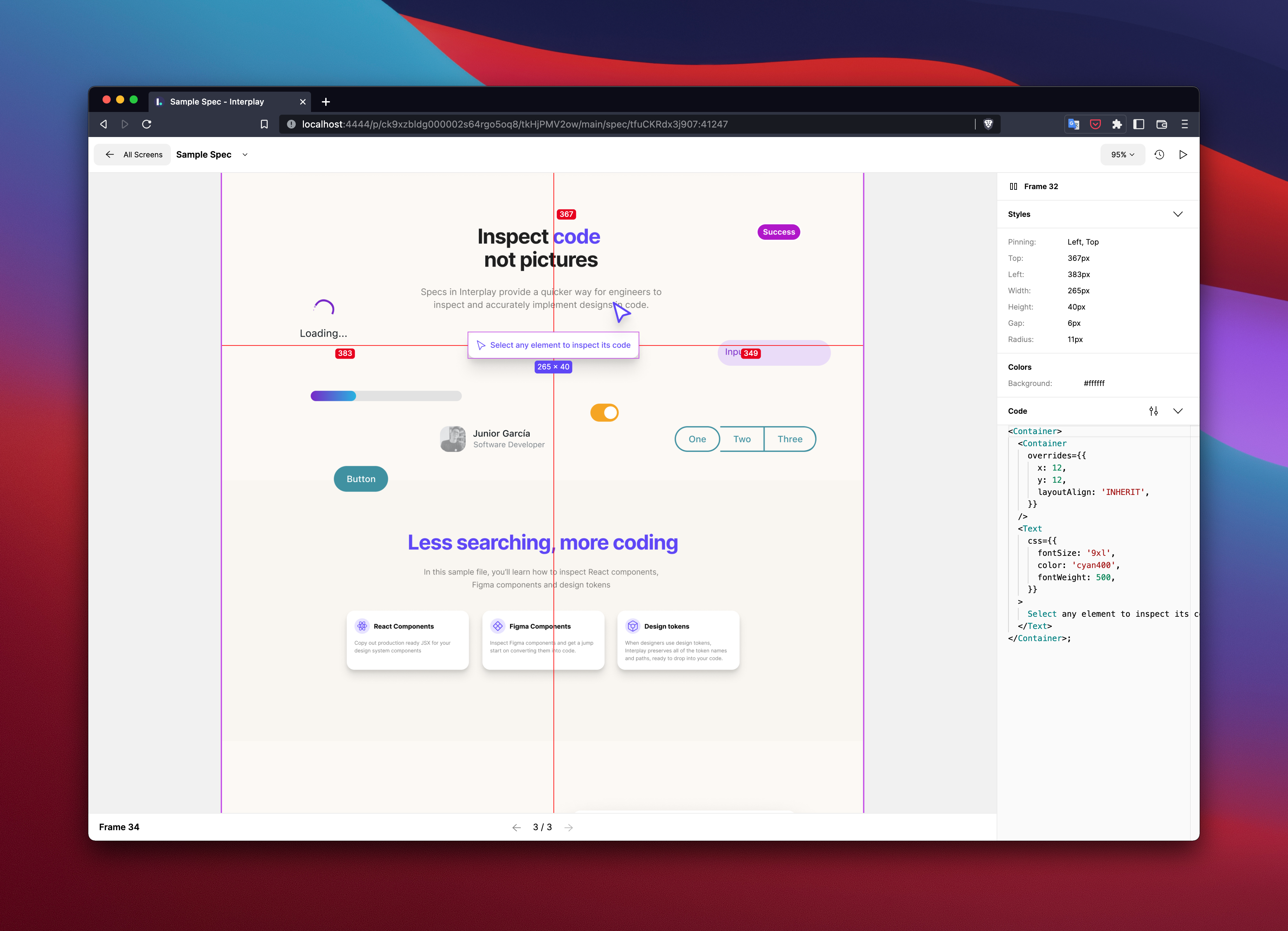
Inspect code, not images
Engineers can select any layer on the canvas and copy the code used in design. This will save hours of detective work, especially for those new to the design system.
If you select a design layer we will display the styles used in CSS or JS object format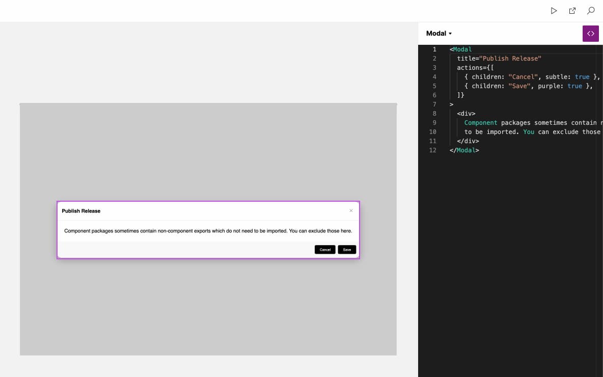 Realistic User Tests
The Interplay preview mode is running your production code components. So now you can be confident you are testing the actual user experience.
Designers can enhance the design and add more fidelity, responsive settings, and add decision design tokens. Engineers can replace parts of the design with new code components, and content designs can tweak the copy. All in a live code environment where you can perform more realistic user testing.
Inspect code, not images
Engineers can select any layer on the canvas and copy the code used in design. This will save hours of detective work, especially for those new to the design system.
If you select a design layer we will display the styles used in CSS or JS object format
The Interplay preview mode is running your production code components. So now you can be confident you are testing the actual user experience.
27th Nov 2021
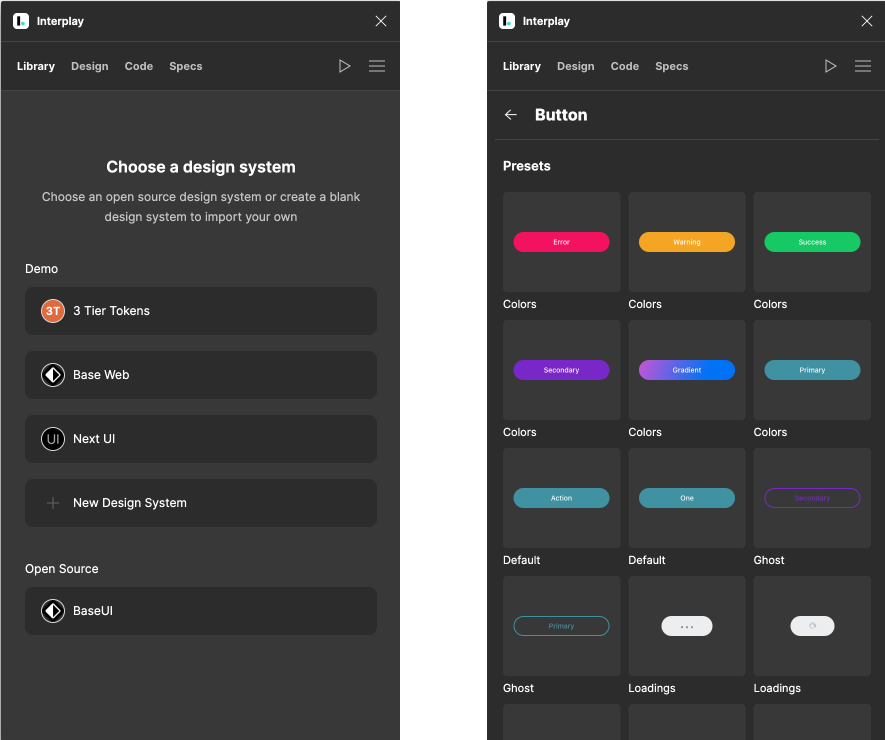
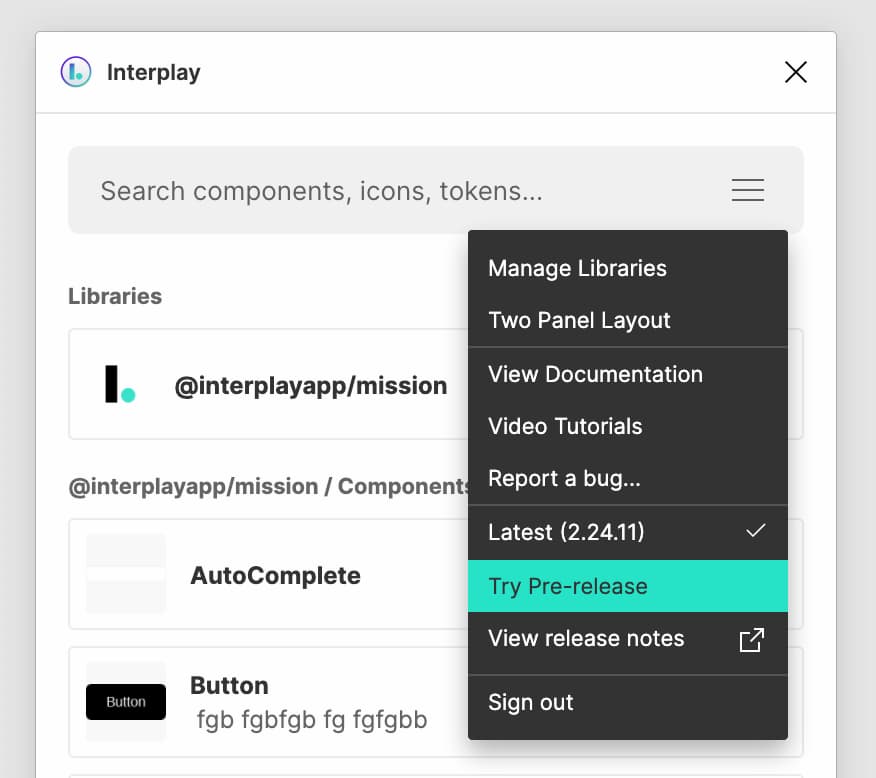
New Plugin UIWe have made some big changes to our plugin in an effort to help you achieve a state of flow while you are designing in your design tool of choice
Opt-in to Pre-release
There are a number of big features in this release, so you need to opt-in to the new experience for now — simply select "Try Pre-release" from the plugin menu.
 Tabs Navigation
Tabs at the top to make it easier to switch between the Library, Design Properties, and Code view.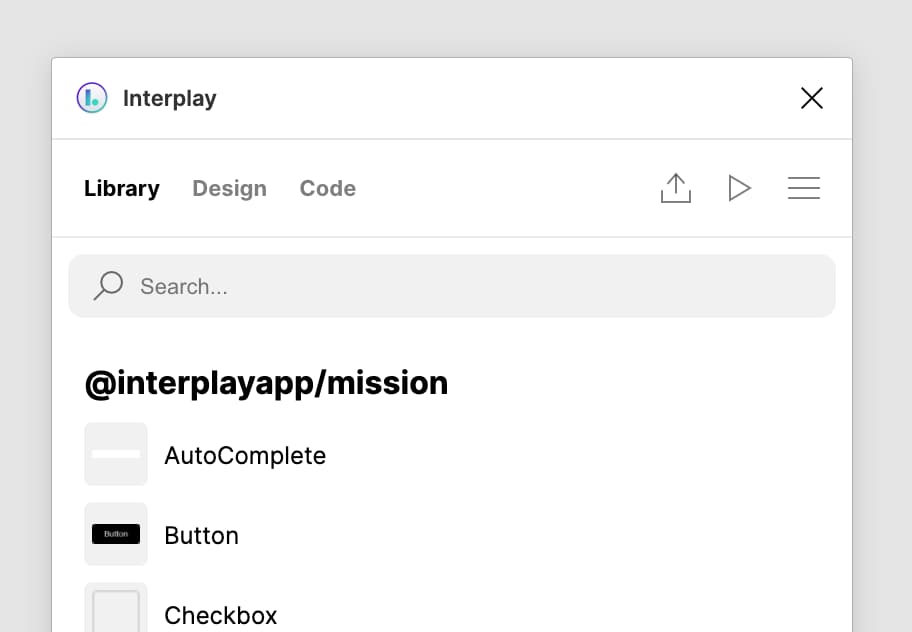 Component Details
The component details page now shows the properties on a component to help with exploring the system. Let us know what other information would be useful to display here.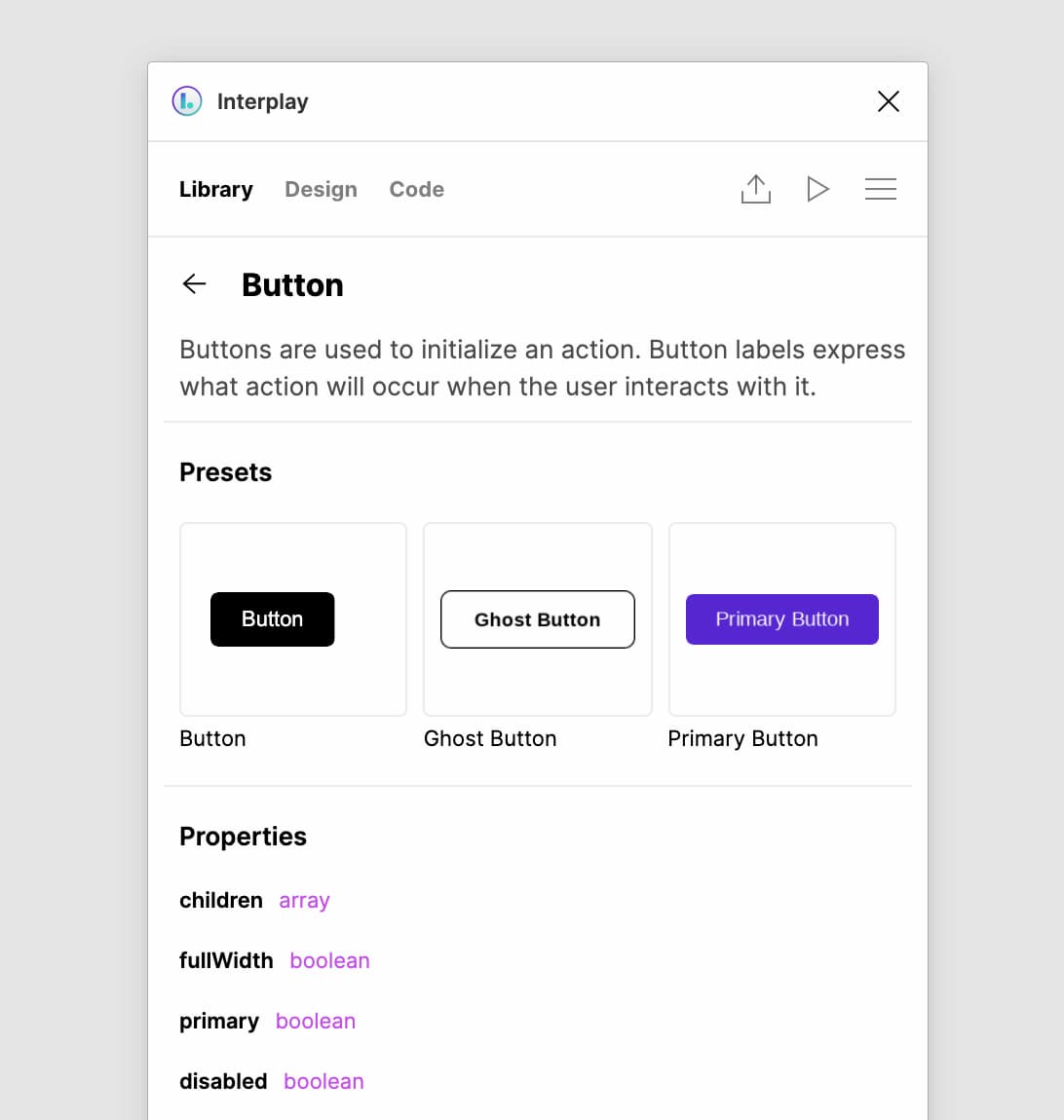 Recently Used
To speed up the design process, we've added recent used components when you enter search mode.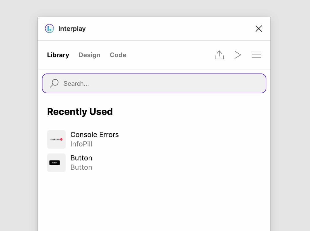 Properties Panel Update
You can now easily swap presets for the select component. This helps explore other common configurations. You can also select the component title to swap the component!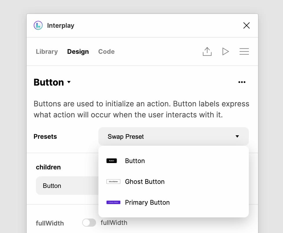
Opt-in to Pre-release
There are a number of big features in this release, so you need to opt-in to the new experience for now — simply select "Try Pre-release" from the plugin menu.
Tabs at the top to make it easier to switch between the Library, Design Properties, and Code view.
The component details page now shows the properties on a component to help with exploring the system. Let us know what other information would be useful to display here.
To speed up the design process, we've added recent used components when you enter search mode.
You can now easily swap presets for the select component. This helps explore other common configurations. You can also select the component title to swap the component!
6th Oce 2021
Improved Interplay CLITo run your components, Interplay requires a UMD build of your component code and a JSON configuration file describing the available properties. The CLI helps you generate these two items, and with this release we've split the import into separate stages for build, parse and deploy to make it easier to control each stage as required for your repo.
The result is that it is now possible to:
Updates
The result is that it is now possible to:
- Let the CLI build your components with our default webpack config, provide your own webpack config, or provide your own build of your components.
- Use the CLI's generated component JSON, programmatically modify it, or provide your own.
- Generate preset config for your components from existing storybook files or docs examples, now controlled by rules to select which instances to use as presets.
Updates
- Improved component parsing for imported prop-types and typescript types
- Control preset parsing with preset rules
- Use JSDoc tags or CLI event handlers to hide props, provide designer-friendly descriptions, set component folders and set allowed component nesting
- Import design tokens from JSON files in your repo
- Environment variable support for key import settings for easier CI setup
- Greatly improved logging and documentation
- Handle recursive schema generation for object props
- Many parsing fixes and enhancements
6th Sep 2021
New Application UI We are excited to release our brand new UI. This is a huge update that helps designers and engineers to work more closely than ever and paves the way for full design editor capabilities.
Inspect code, not images
Engineers can select any layer on the canvas and copy the code used in design. This will save hours of detective work, especially for those new to the design system. If you select a design layer we will display the styles used in CSS or JS object format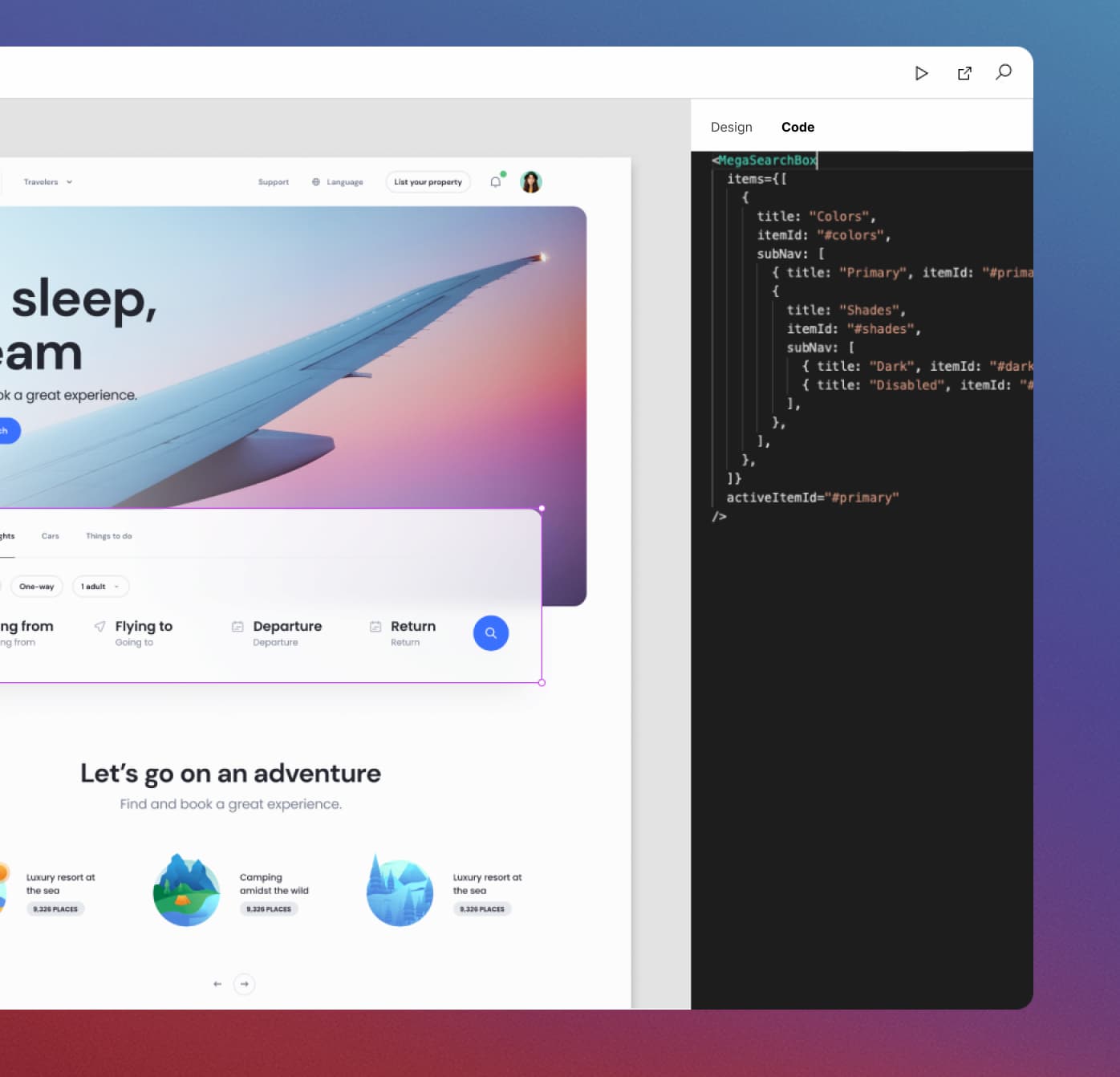 Component Docs
We've cleaned up the components page to make it easier to scan component usage and properties. You can also easily arrange the components into folders with the drag and drop left nav.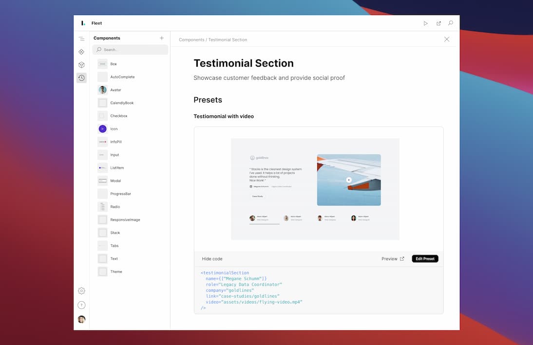 Better Version Control
You can now clearly see what has changed across your project. From the version control you can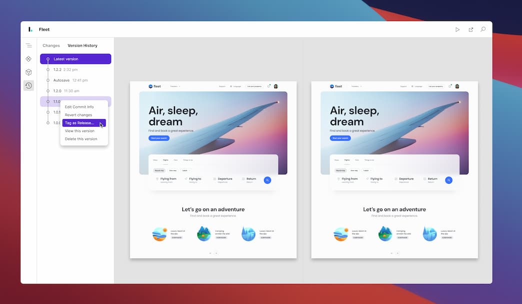
Inspect code, not images
Engineers can select any layer on the canvas and copy the code used in design. This will save hours of detective work, especially for those new to the design system. If you select a design layer we will display the styles used in CSS or JS object format
We've cleaned up the components page to make it easier to scan component usage and properties. You can also easily arrange the components into folders with the drag and drop left nav.
You can now clearly see what has changed across your project. From the version control you can
- See before and after previews for each preset of screen change
- Selectively commit the changes, or discard a change if it was a mistake
- Tag a release in from the History tab. Just right click on a commit to tag.
Get startedSupercharge your design systemInterplay helps high performing product teams work together and collaborate with code as the single source of truth.Get started for free →
Copyright © 2022. Interplay, Pty Ltd. All rights reserved.